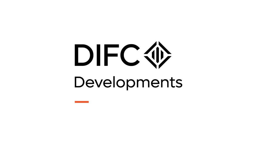
Primary Brandmark - Rollover and click to download logo pack
Brand Use
Please ensure these components are downloaded from the approved sources and never recreated in any manner – unless specified otherwise – for example for new graphic illustrations.
Brandmark Versions
The following are the approved brandmarks for use across the entire DIFC Developments brand.
Brandmarks should never be modified and always appear in proportion, following the minimum clear space rules whenever possible.
There are two key variants of the brandmark – stacked and horizontal, and a single brand icon that can be used independent of the full brandmark.
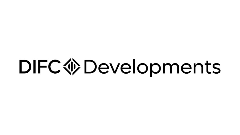
Secondary Brandmark - Rollover and click to download logo pack
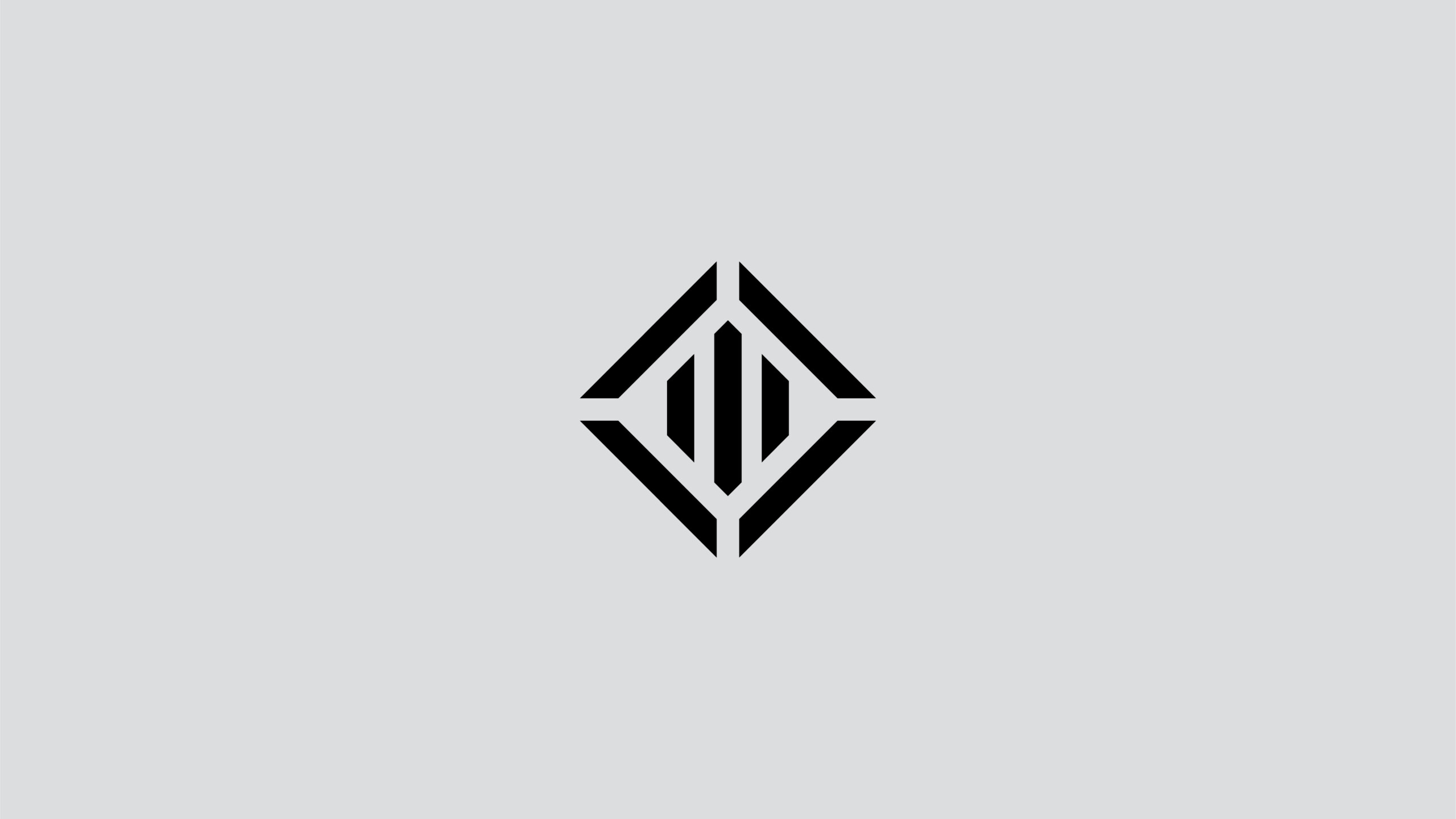
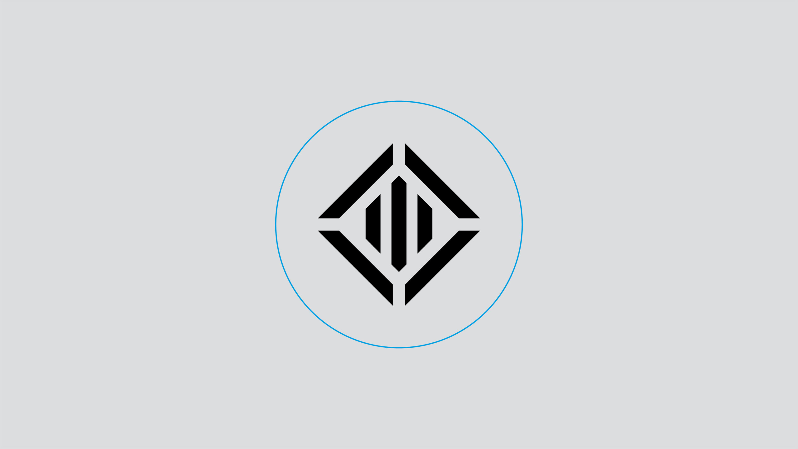
Brand / Fav Icon
The DIFC icon should only be used within social media avatars, or other digital applications requiring a favicon. The favicon uses the DIFC Technology Black colour on white.
This should NEVER be used as an independant graphic component.
The DIFC icon should NEVER be modified in any manner.
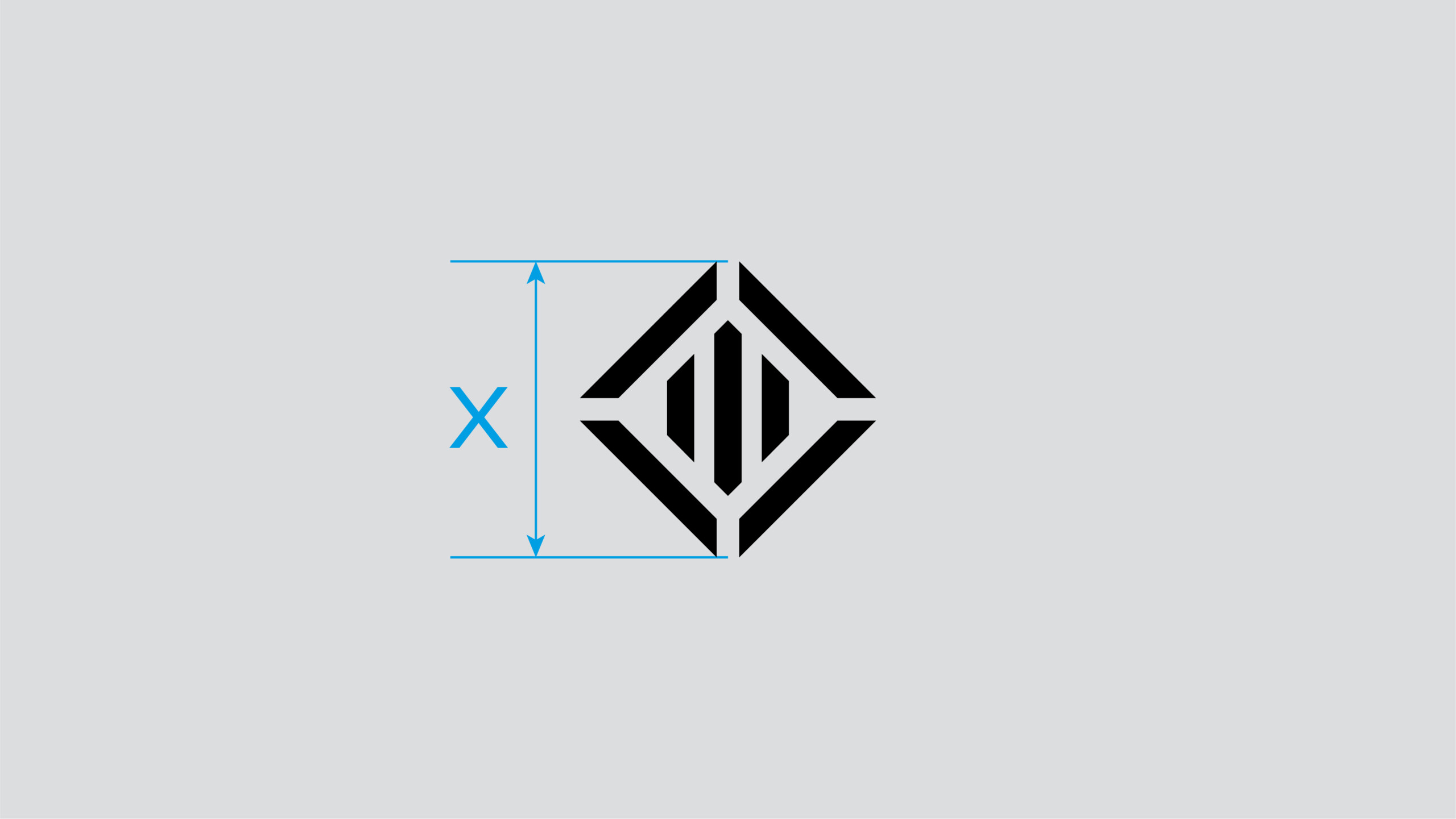
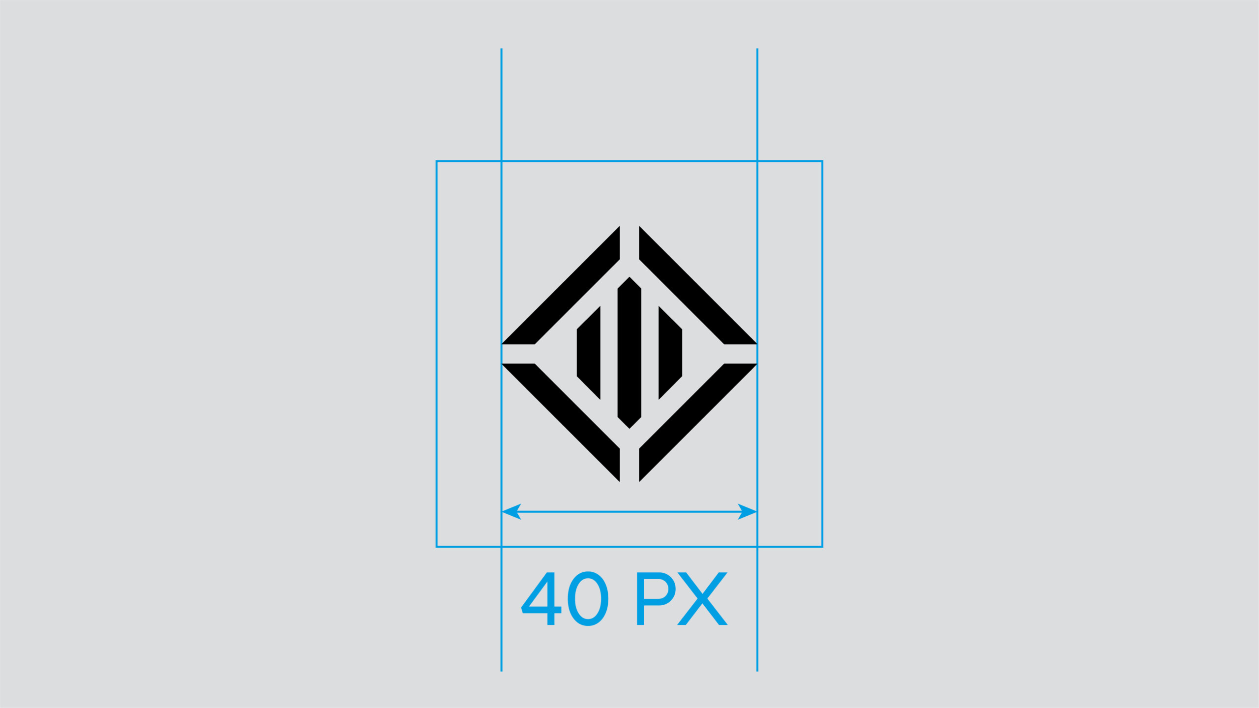
Minimum Size
The minimum width for the icon is set at 40px on a 227dpi size screen and should never be utilised at a smaller size. This ensures the legibility of the brand icon is always maintained.
Usage
The brand icon should be avoided being over used, and not feature in the same substrate or screen wherever the full brandmark is featured.
In digital applications, both brandmark and brand symbol use should be avoided whenever possible – unless it is a function of a particular application. For example the icon featuring in the browser bar, with the full brandmark featured on the website.
Special Use Brandmark - Horizontal
The following horizontal variant of the brandmark should ONLY be used should there be a restricted space for the application of the brandmark for example extreme horizontal application such as wide format billboard or in very specific situations within digital applications.
The horizontal brandmark can also be considered for use in exceptional circumstances on dedicated VVIP communication – such as an invite to special event.
However whenever possible the stacked brandmark should always be the default brandmark of choice to use.
Secondary Horizontal Brandmark
Usage Rules
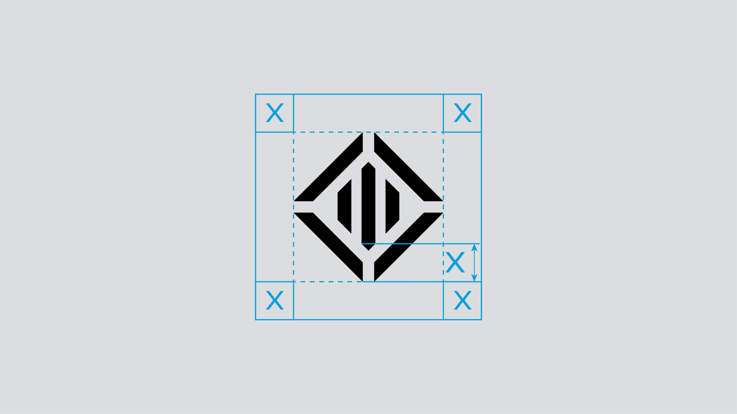
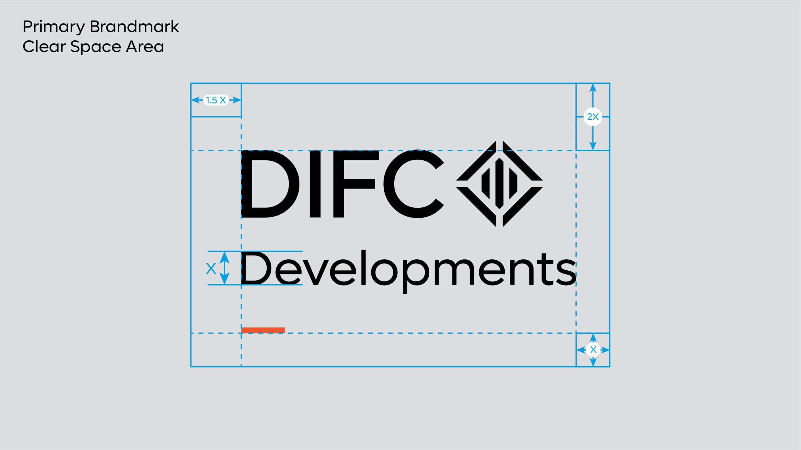
Clear Space
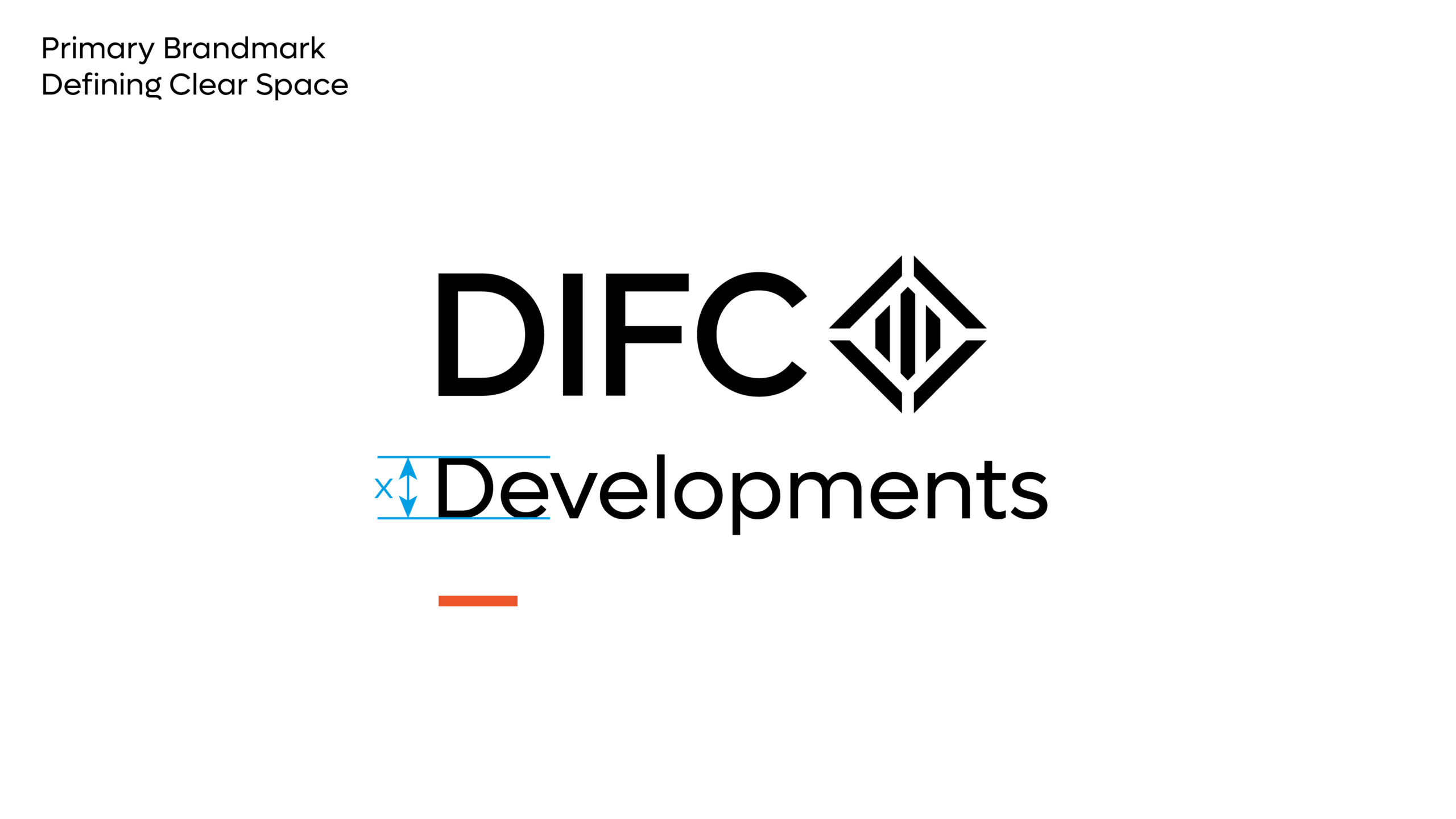
Clear space is equal to the CAP-height of the ‘Developments’ typography, shown using X and should be adhered to strictly whenever possible. The following is a breakdown of the clear space required around each brandmark variant.
Defining Clear Space
1. The CAP-height of the Developments typography is used to determine the clear space.
2. The clear space at the right and bottom of the brandmark is equal to a x1 x-height.
3. The clear space at left of the brandmark is equal to a x1.5 x-height.
4. The clear space at top of the brandmark is equal to a x2 x-height.
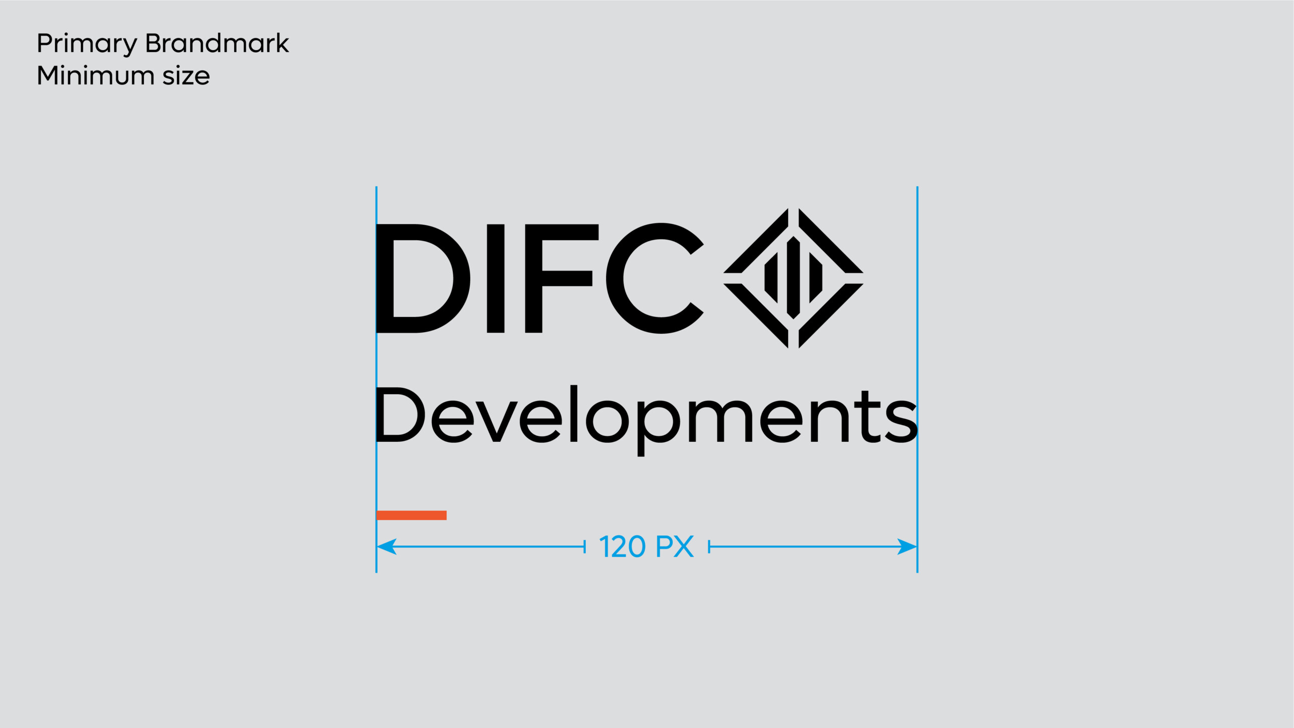
Minimum Size
The minimum size rules should be adhered to strictly. This will ensure the DIFC Developments brandmark is always legible across all applications. Visuals not shown to scale.
Colour Versions
There are two colour variants of the brandmark.
The primary brandmark should always be implemented in the full black colour variant. This should be used across all physical and real world applications such as printed collateral, signage, and architectural applications.
The white-out version of the brandmark should be used when legibility is limited when the black colour variant is used.Â
Usage: Latin Brandmark
Co-Branding
The following are the basic principles when utilising the DIFC Developments brand together with destination or product brands.
There are two distinct implementations of the brand when creating marketing communications with external brands.
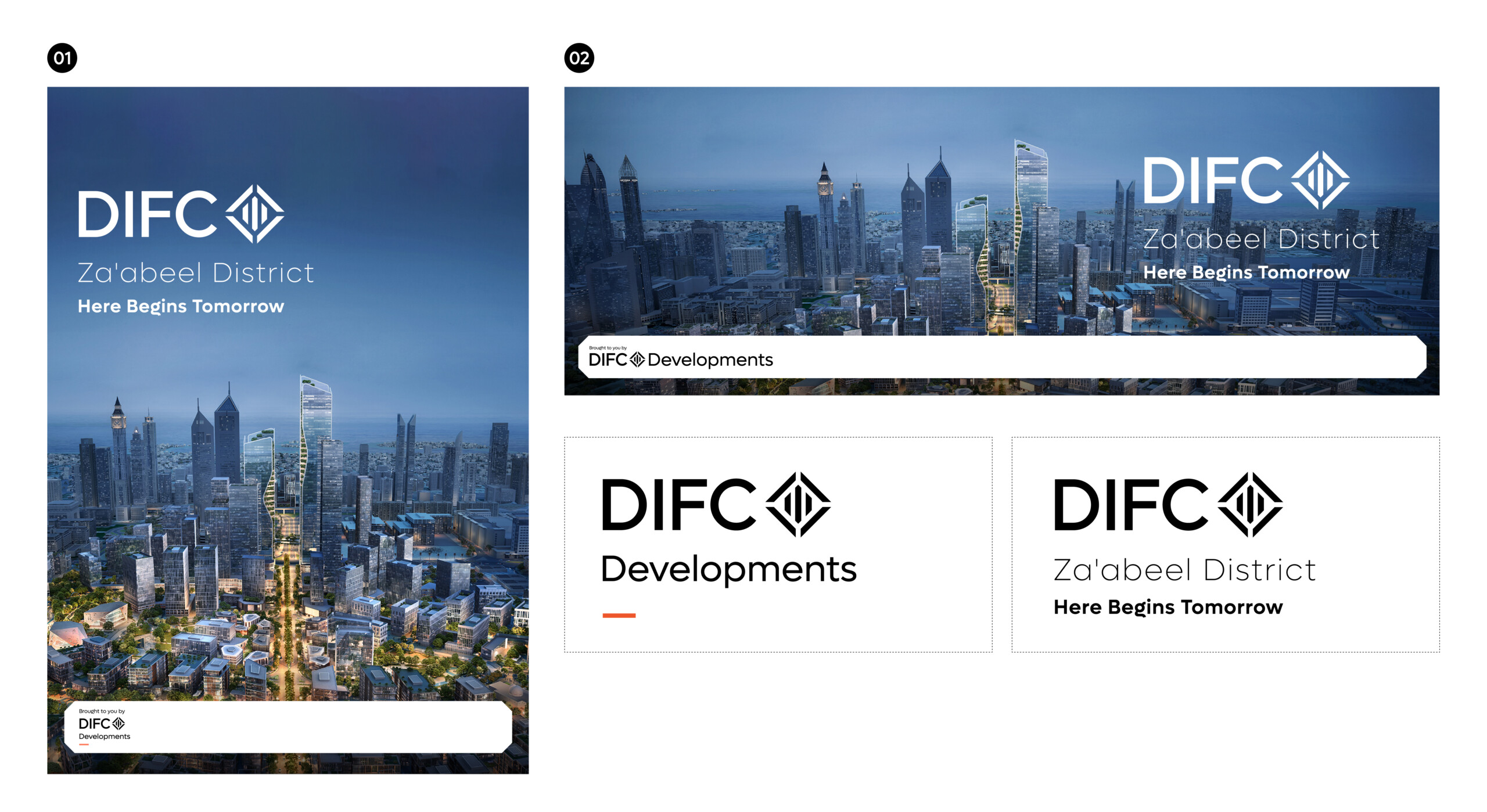
- DIFC Developments as the brand that is bringing the destination brand, with both brands taking a similar weighting.
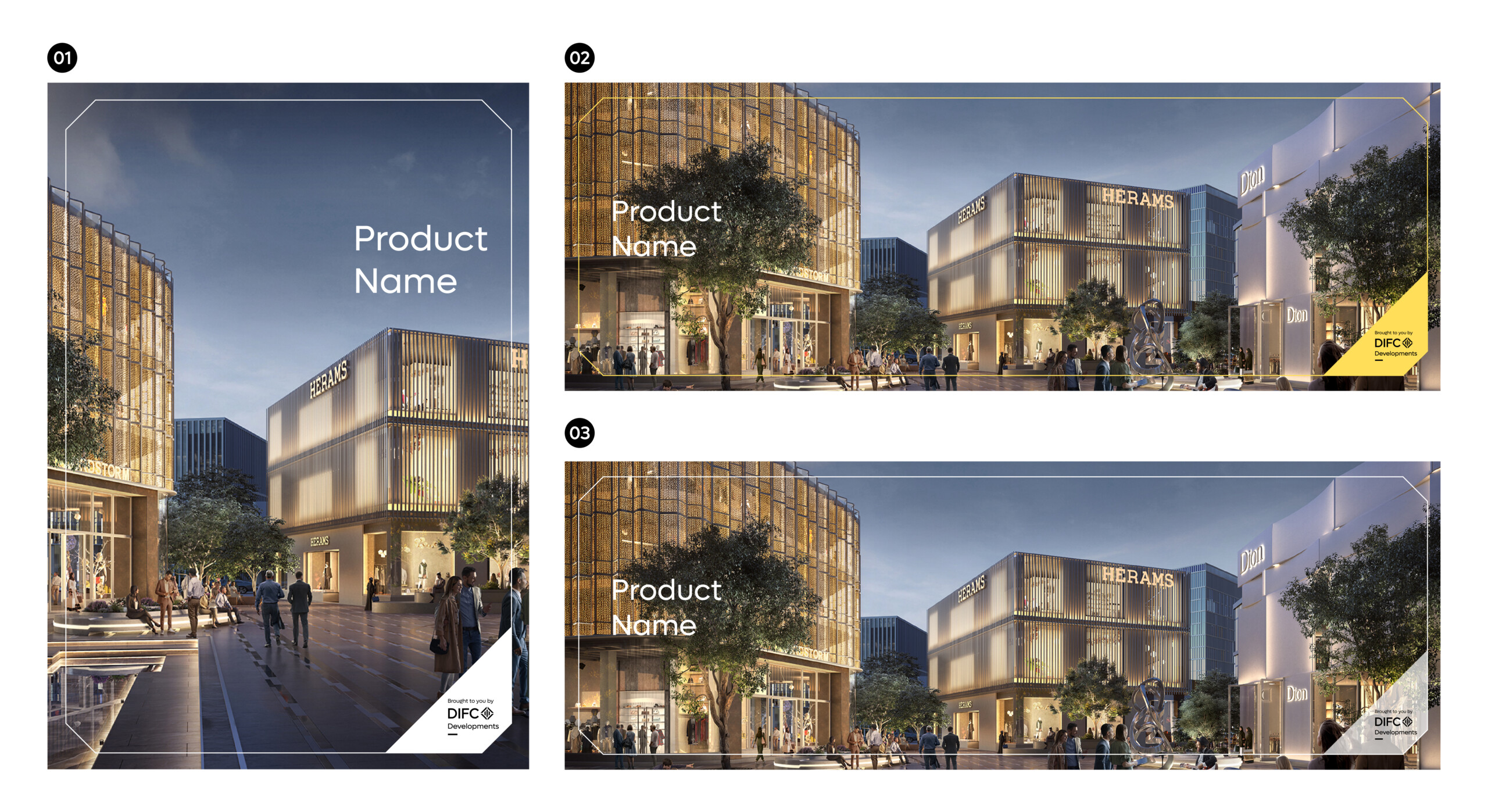
- A DIFC Development product featured by DIFC Developments.
These principles apply all brand executions, across events, digital applications and marketing comms.
The holding device is used to reinforce the DIFC Developments brand throughout all destination marketing collateral.
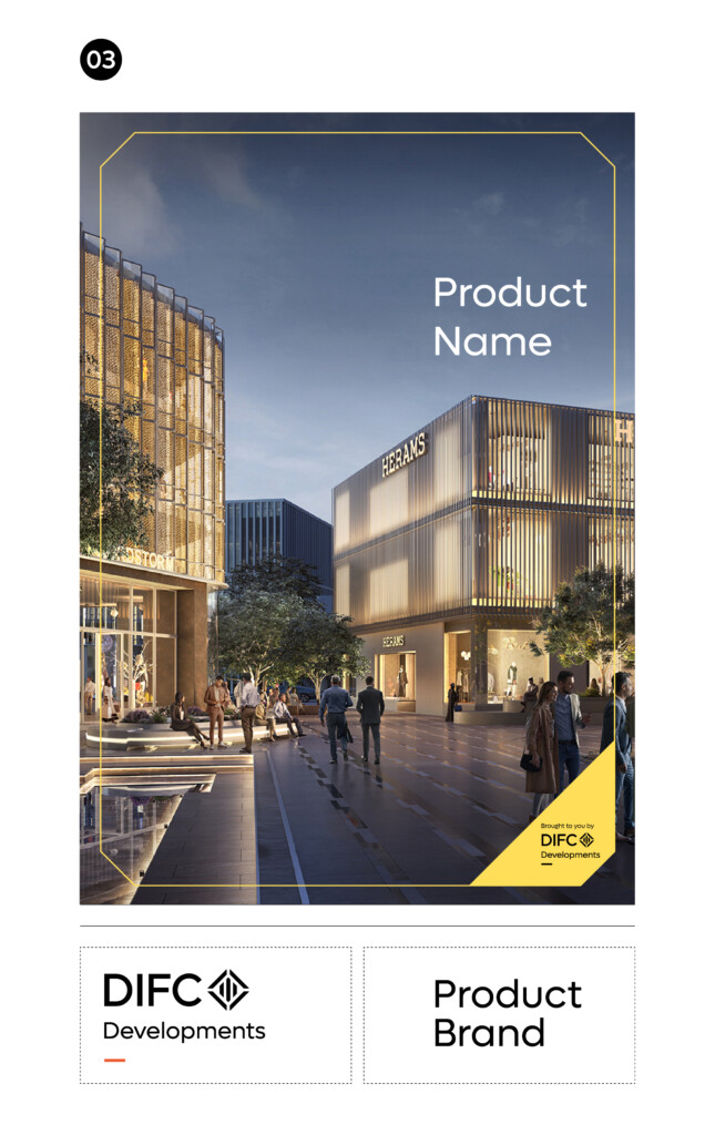
Whenever DIFC Developments features a product brand, the secondary framing device should be utilised.
Note: The colour of the frame can adopt the featured product brand colours, or a complementary colour from the DIFC Developments secondary or tertiary palette.
Colour Palette
The following is the brand colour palette for DIFC Developments and a guide to the ratio of colours that can be used across brand application. The ratios should be followed closely amongst the entirety of an individual application. Judgement should be used when additional impact or differentiation is required within an individual screen or section of a communication.
Rollover and click to download Adobe Illustrator Swatch File.
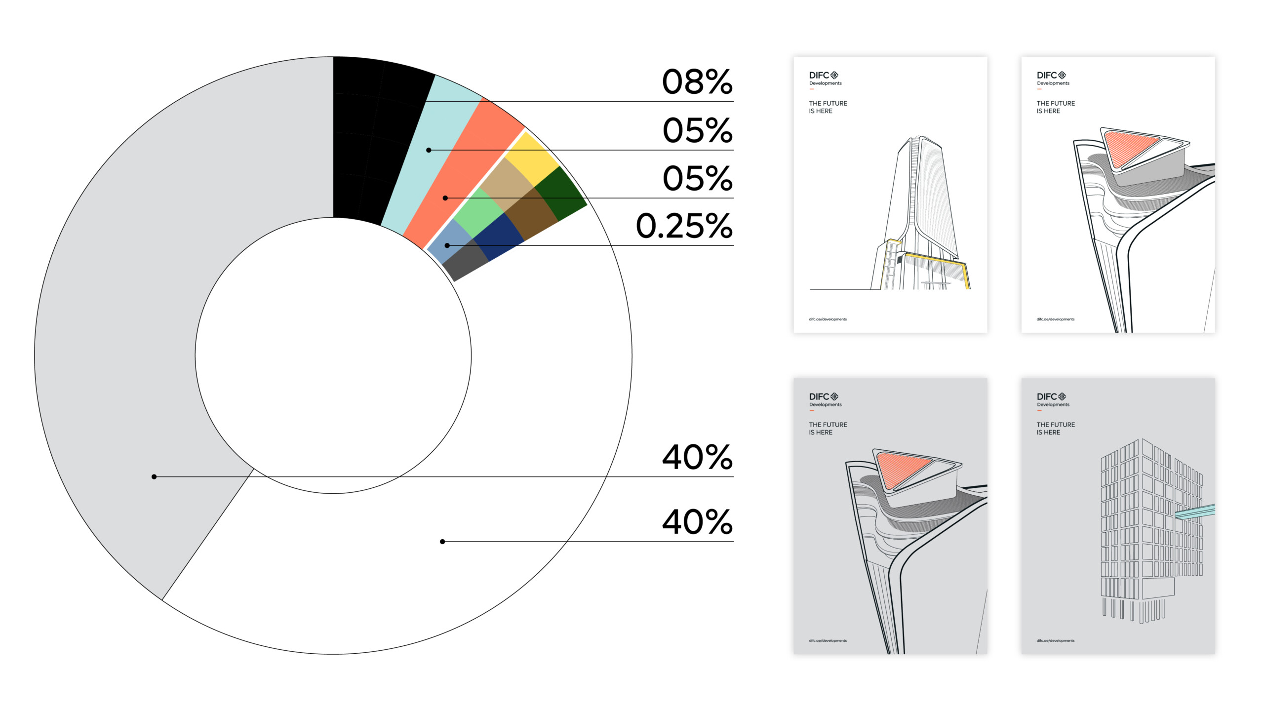
Primary Palette
Stone Grey
#dcdddf
220.221.223
C 15. M 07. Y 10. K 04
427 U
Sirius White
#ffffff
C 00. M 00. Y 00. K 00
N/A
Technology Black
#0a0a0a
000.000.000
C 30. M 00. Y 00. K 100
Black C
Tangerine Orange
#ff7d5f
255.125.95
C 00. M 53. Y 89. K 00
1645 U
Secondary Palette
Marine Sky Blue
#b3e2e2
179.226.226
C 25. M 02. Y 07. K 00.
290 U
Tertiary Palette
Sun Yellow
#ffdf5a
255.223.90
C 00. M 04. Y 95. K 00.
108 U
Jade Green
#83db8f
131.219.143
C 46. M 00. Y 43. K 00.
352 U
Earth Brown
#c4aa7c
196.170.124
C 04. M 06. Y 32. K 10.
4545 U
Stone Blue
#7ca0c1
C 50. M 19. Y 00. K 00.
2121 U
Luxury Palette (Special-Use Only)
Forrest Green
#144c0e
20.76.14
C 89. M 11. Y 84. K 39
7484 U
Deep Marine Blue
#18326d
24.50.109
C 100. M 82. Y 02. K 06.
2147 U
Stone Brown
#725227
114.82.39
C 00. M 46. Y 83. K 58.
2320 U
Charcoal Grey
#515151
C 44. M 35. Y 41. K 47.
2335 U
Typography
These are some examples of how the brand typography can be utilised within communications.
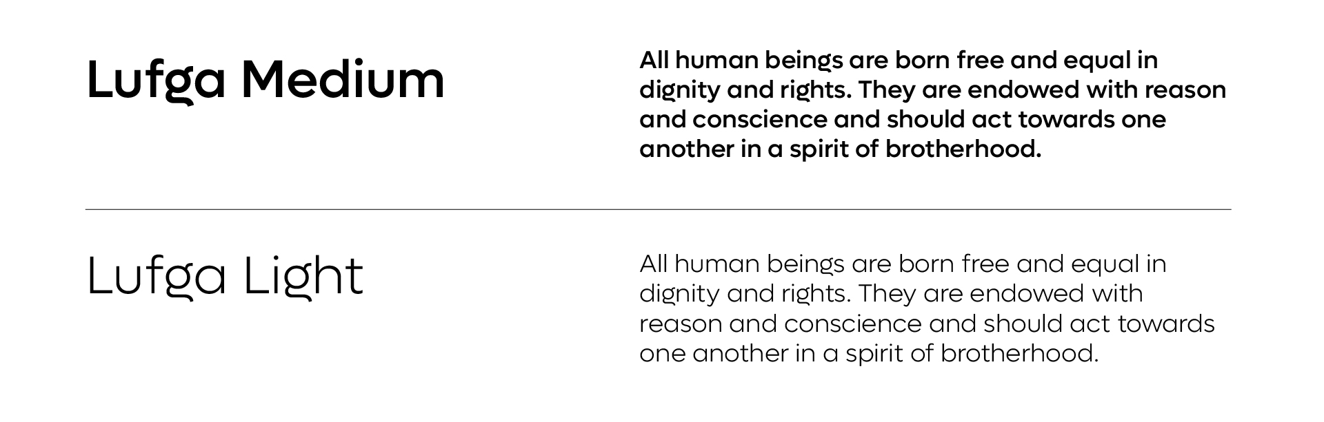
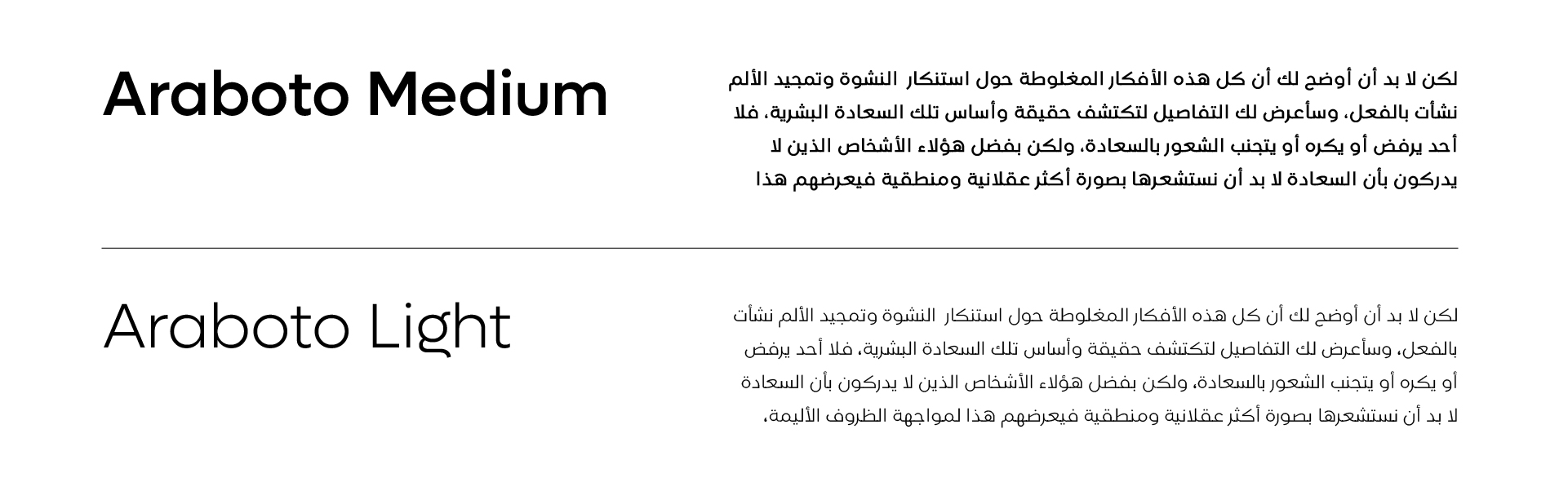
Typography should always be implemented in a clean and structured manner. Particular attention should be given to the weights used for body copy and headlines. Both Lufga and Araboto are available in multiple weights, and dependant on the use case – additional weights can be used if deemed necessary to create a greater hierarchy of information – for example in information graphics or illustrating abstract or complex business concepts.
However as a general rule, the following weights should be primarily used. Note that digital and print use different weights. This ensures better clarity and better alignment of how fonts are viewed on screen vs printed on physical medium.
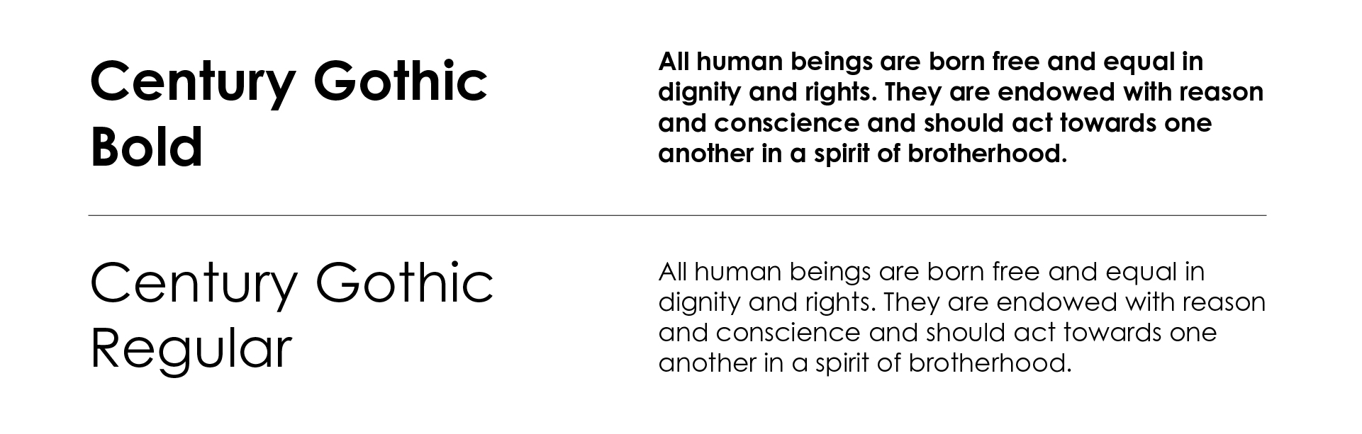
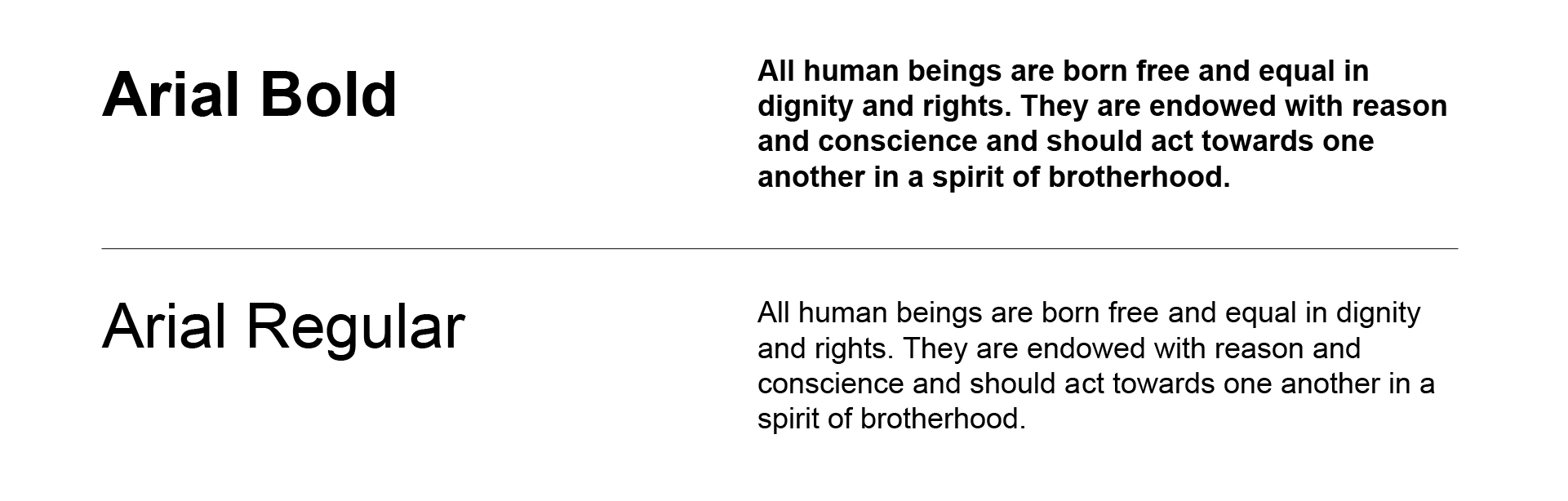
Latin Typeface: Digital
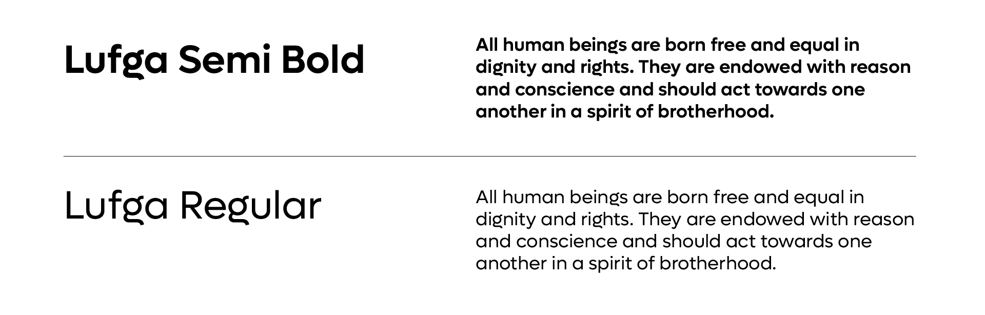
Latin Typeface: Print
Arabic Typeface: Digital
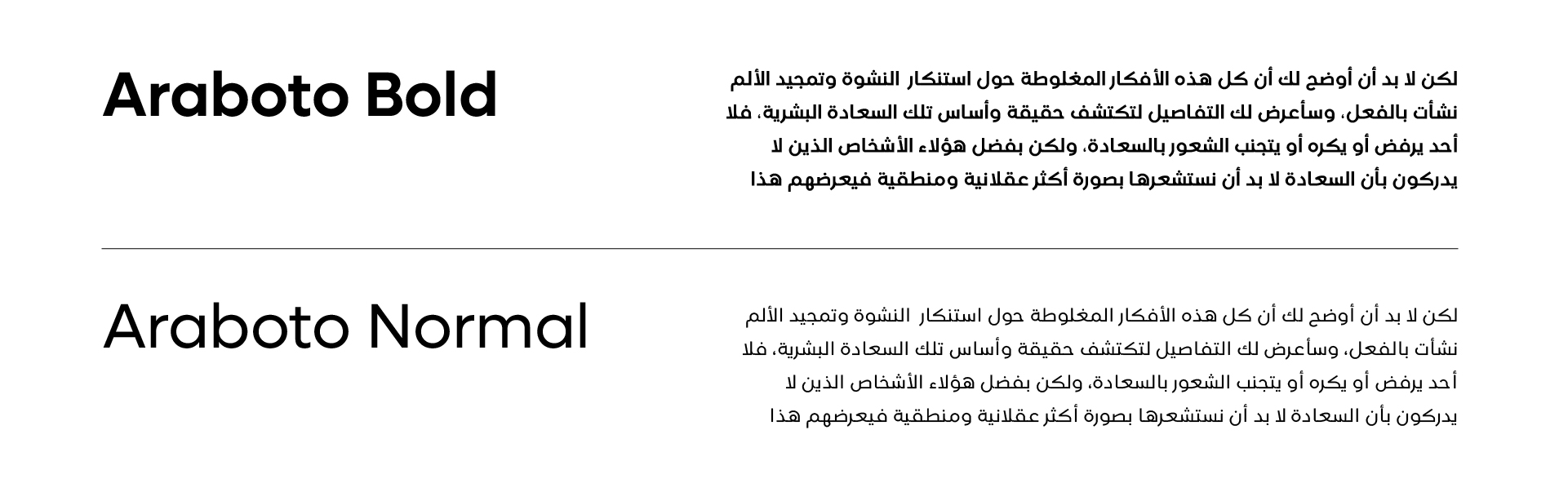
Arabic Typeface: Print
Websafe Type
Email only typeface
Typography Rules
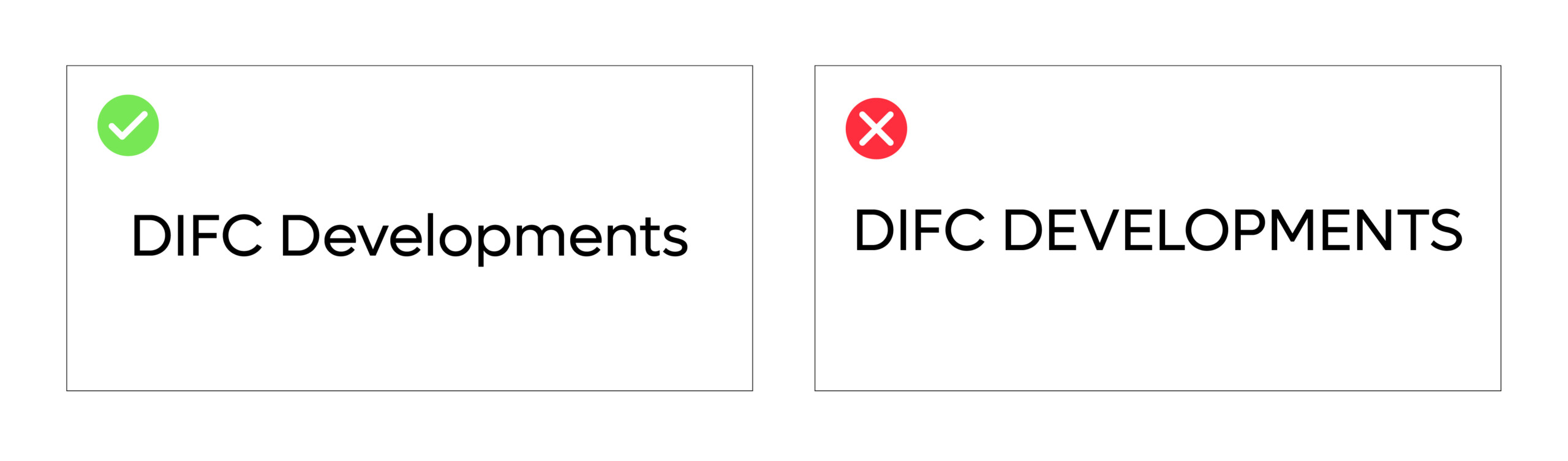
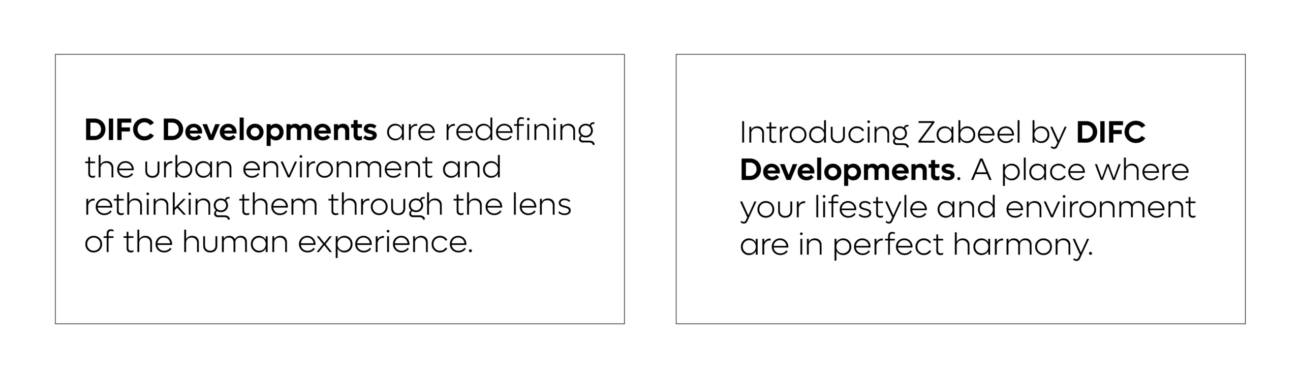
Typing DIFC Developments
Always ensure DIFC Developments is written in body using mixed-case characters to ensure consistency and ensuring the brand name is distinguished from regular copy.
DIFC Developments should always be written using uppercase characters for DIFC, with the capitalisation of Developments across all communications.
1. Capitalised sentence case is easier to read overall.
2. Capitalised sentence case creates a differentiation between DIFC Developments – when written in body copy.
3. Developments when capitlised case cannot be confused as within body copy.
The following are examples of how DIFC Developments should be written within copy or set in applications.
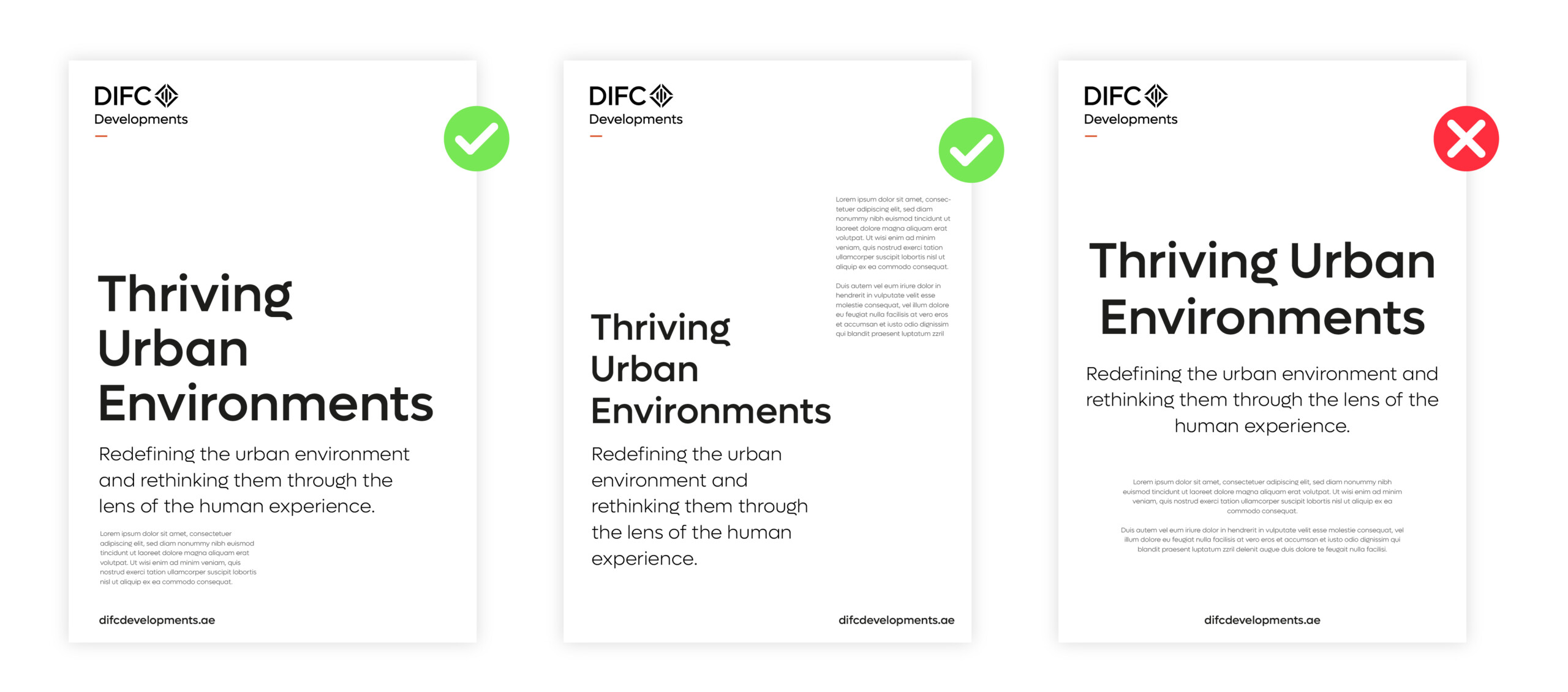
Typography Alignment
We recommend typography is always aligned left whenever feasible. This ensures a consistent look throughout all applications and adopting an inherent design integrity across layouts for both digital and print.
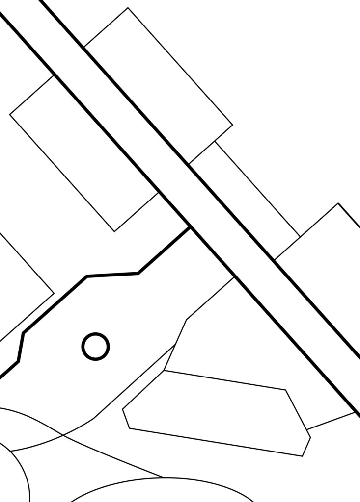
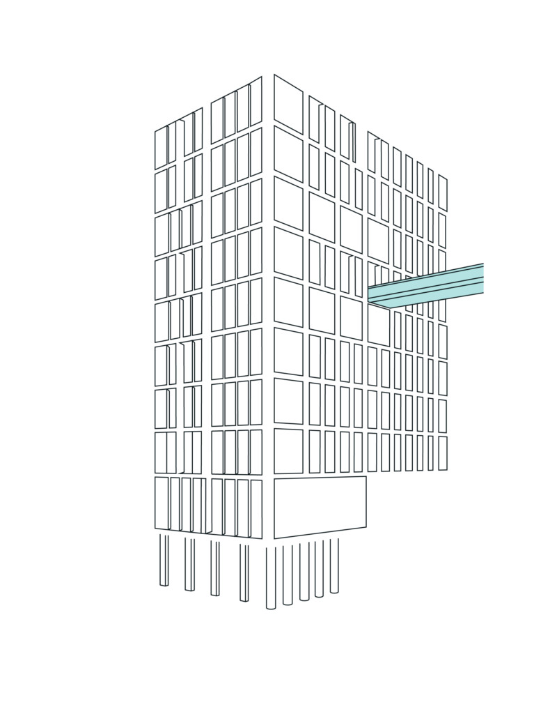
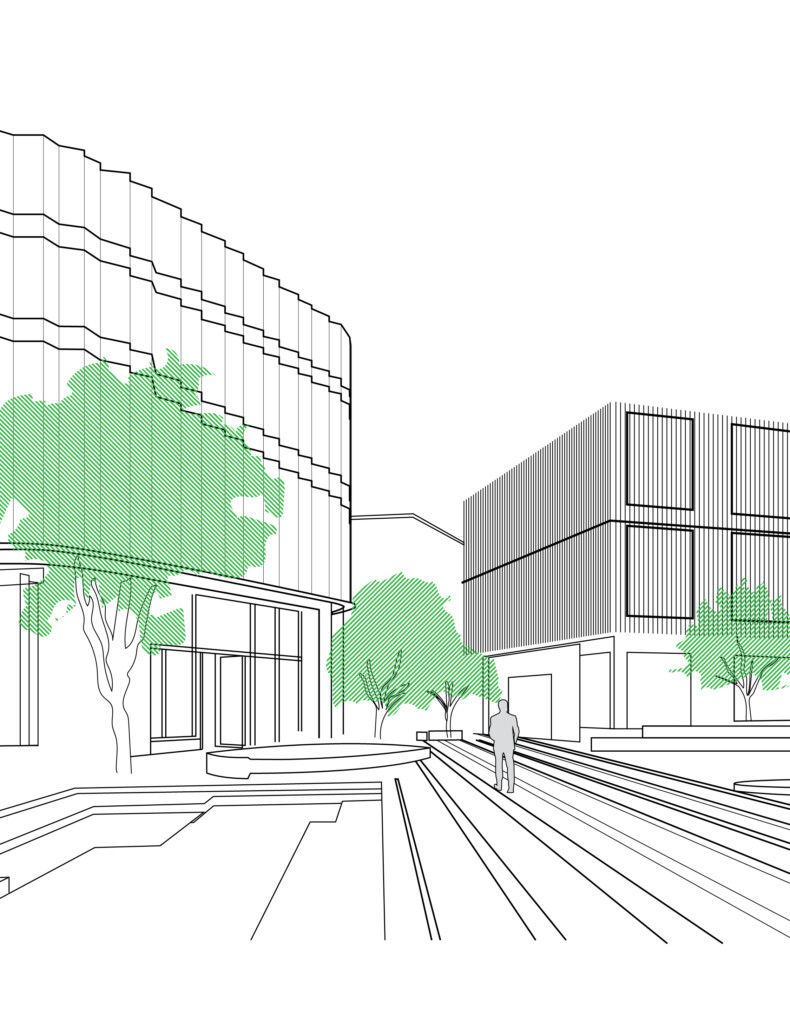
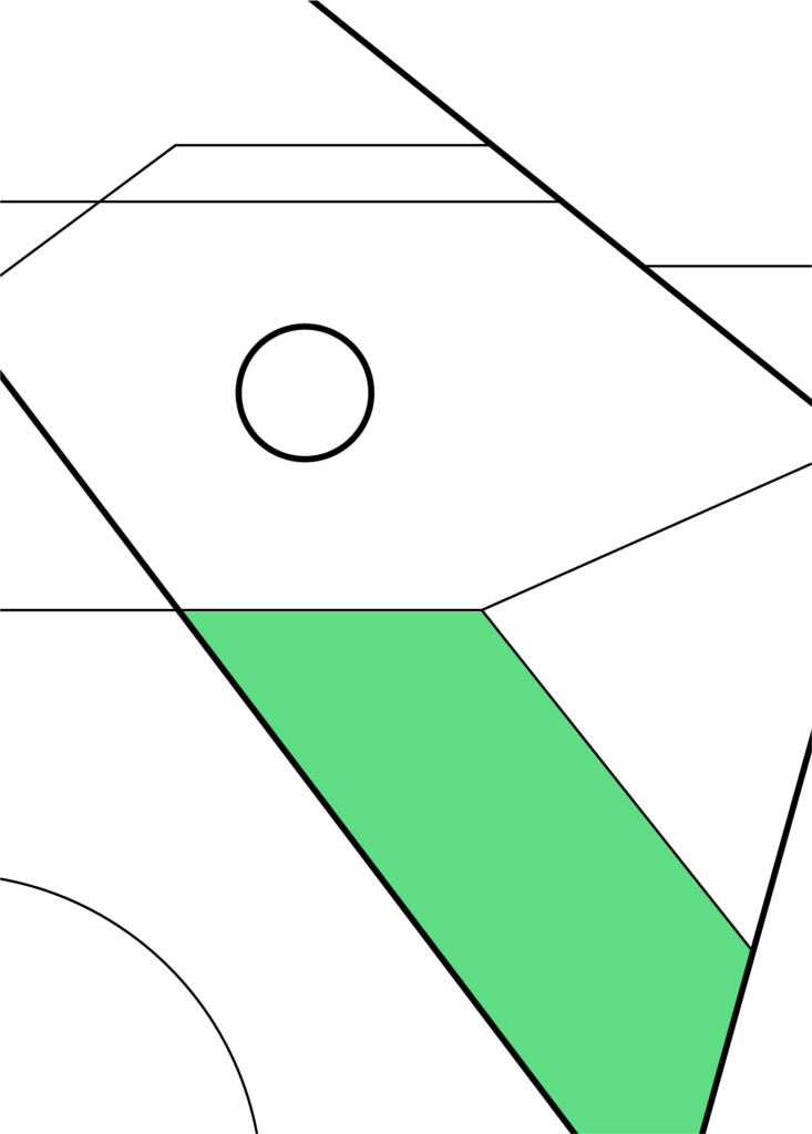
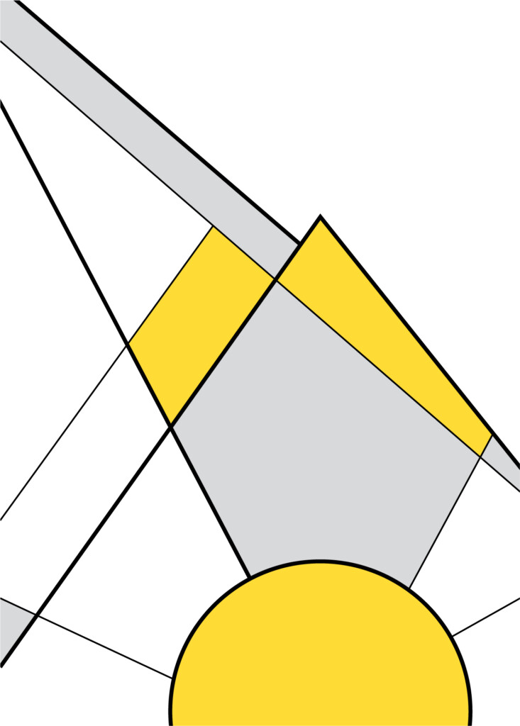
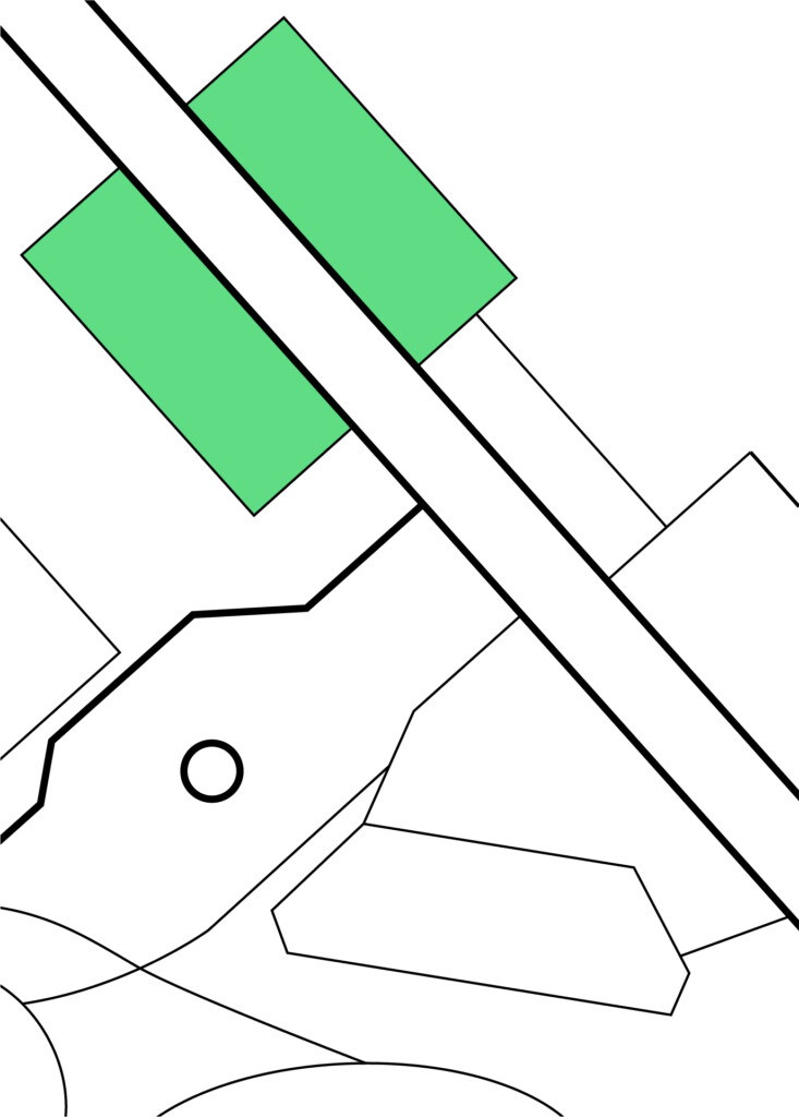
Graphic Language
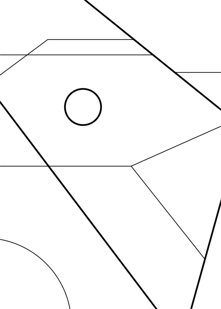
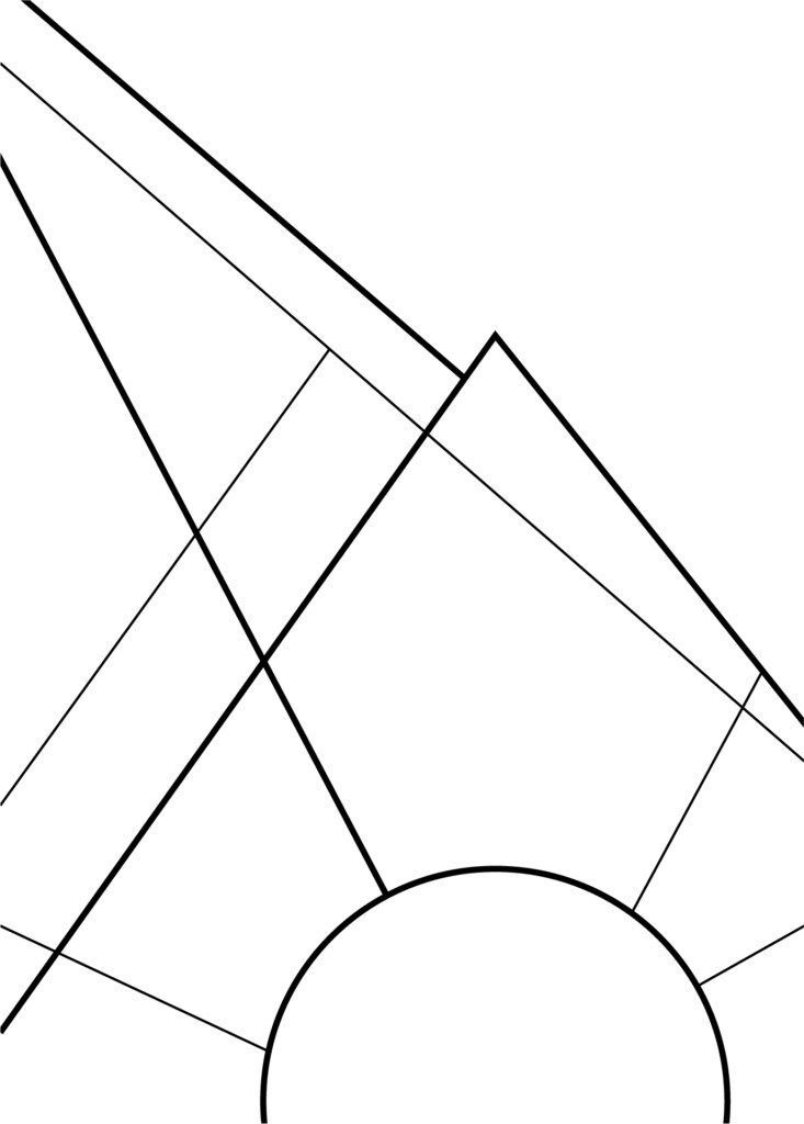
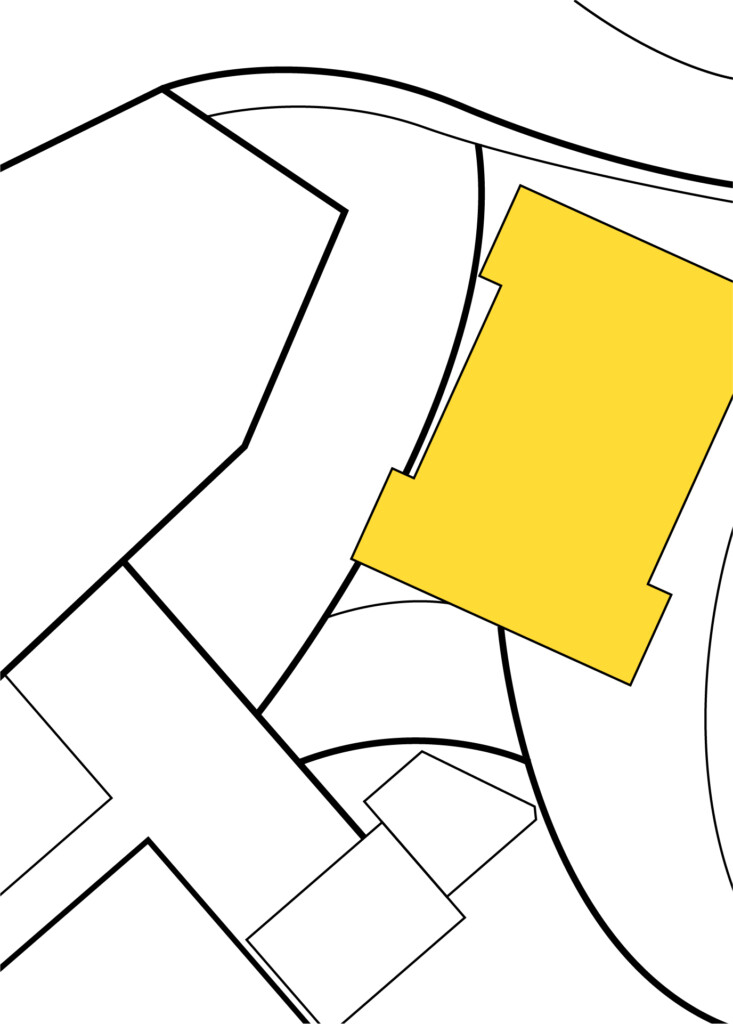
Graphic Illustrations
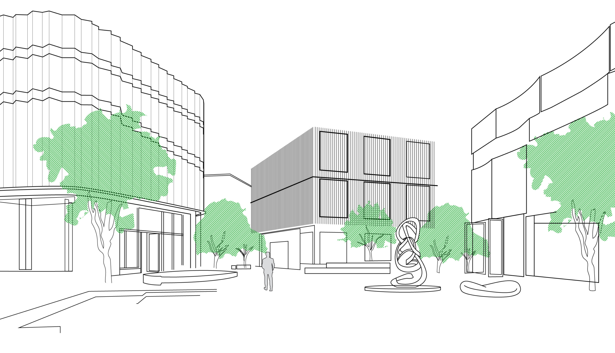
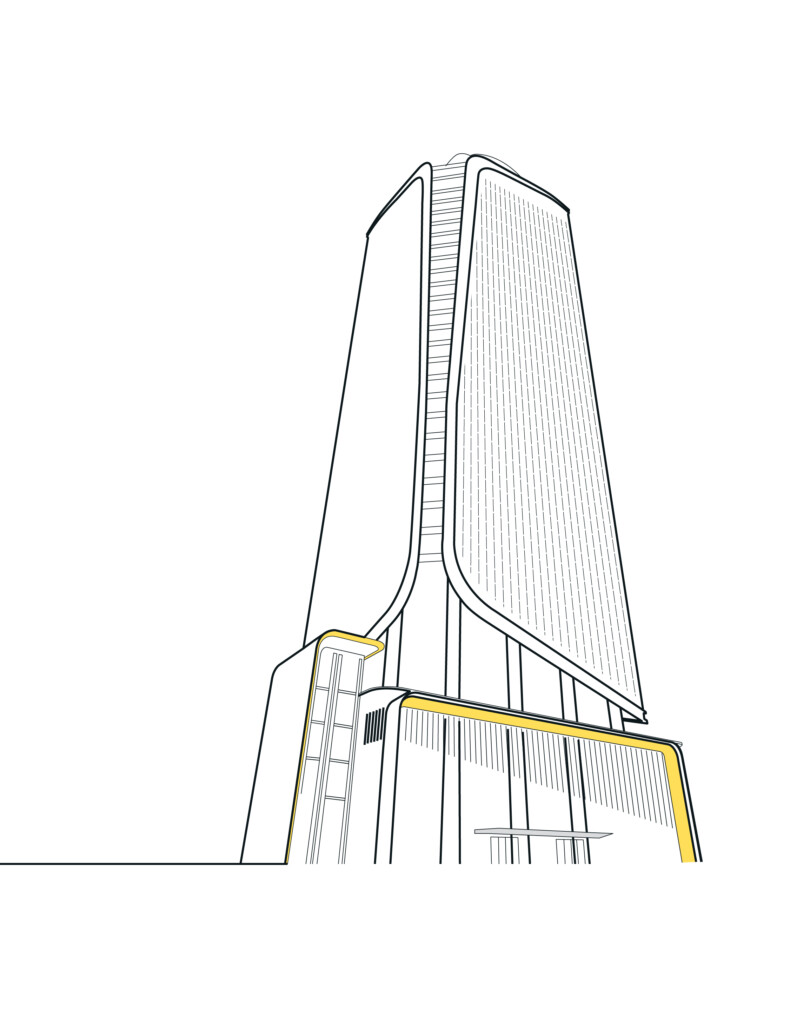
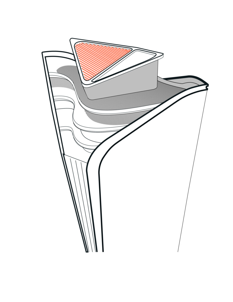
The following are a select number on graphic illustrations that are part of the visual toolkit for DIFC Developments brand.
These illustrations are based on products, environments and locations that are being created by DIFC Developments. Shown here are four illustrations which should be built upon as more products are featured and launched.
Colour usage rules
1. Illustrations should be in black key line.
2. Background colour should either be white or stone grey across all use-cases.
3. Premium colours can be utilised for VVIP communications as required.
Basic Principles:
When creating new illustrations, it is essential that illustrations do not feature more than three line weights.
Illustrations should highlight the primary architectural components of product and locations, while minimising and removing minor details. Illustrations should essentially capture the essence of the architecture using minimal line work.
A single specific component within the illustrations can be highlighted to create both intrigue, personality and  vibrancy.
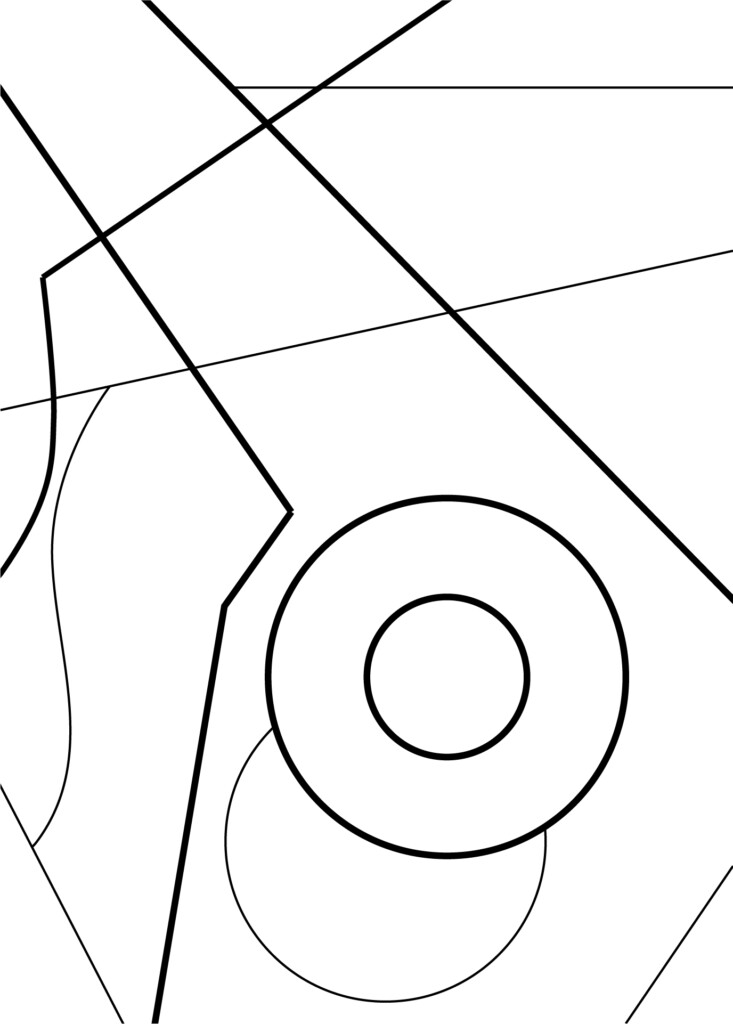
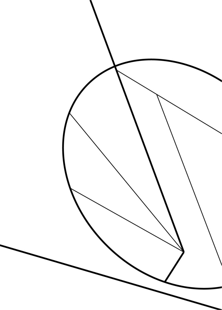
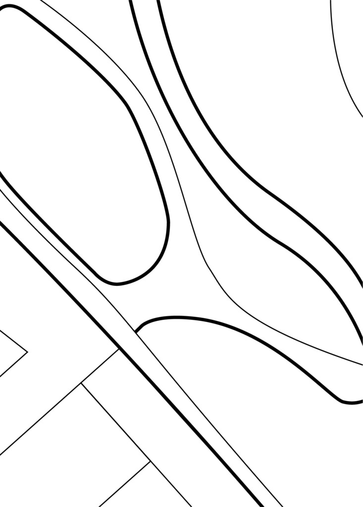
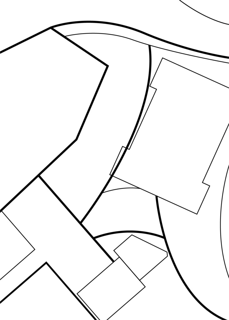
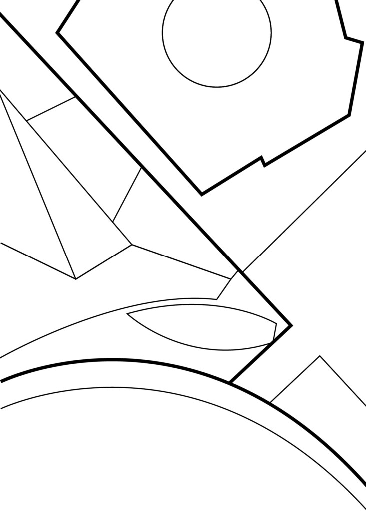
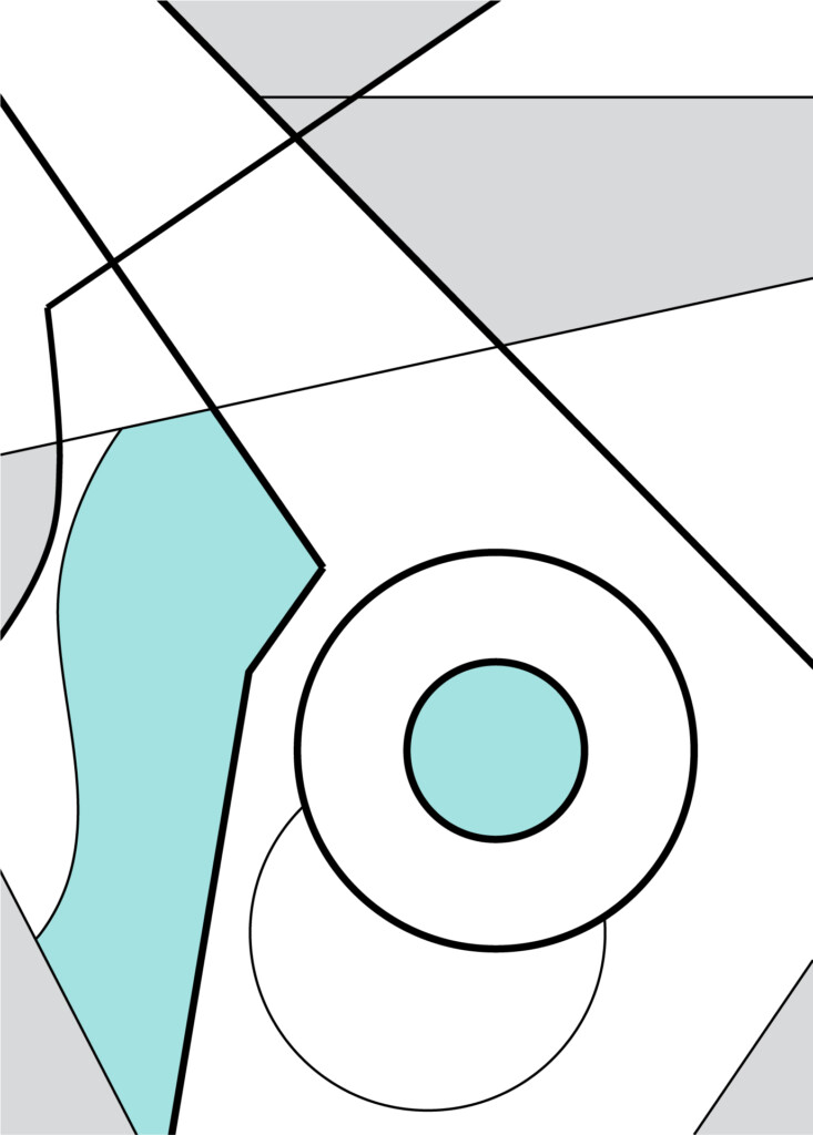
Tertiary Components: Brand Texture
The brand texture for DIFC Developments is a tertiary visual component for the brand. These textures should be used sparingly and never become a dominant component of the brand.
Brand texture concept
The brand texture has been created from the masterplan layout and plan of DIFC Developments. It is a simplified form, highlighting specific areas of the masterplan to create an intriguing, and distinctive brand texture that is in line with the DIFC brand personality. These textures can both work as a subtle element or a visually energetic component dependant how it is utilised.
Colour Formats
There are two distinct formats, the colour format where a specific component is highlighted in the tertiary palette, and a more minimal version with no colour – which can used in more premium applications and marketing material.
Brand texture use-cases
1. Background textures for ambient areas within branded environments.
2. Divider pages within brochures and digital presentations.
3. Screensavers or marketing material that requires a bit of energy and personality.
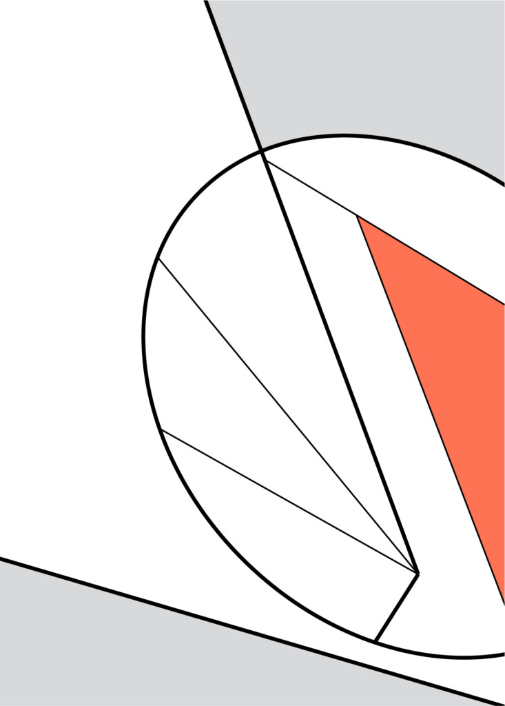
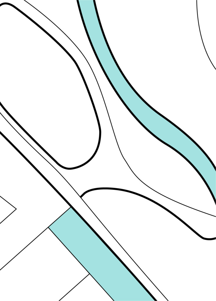
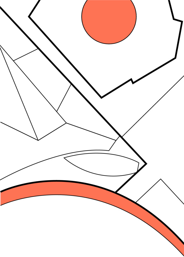
Brand Texture: No Colour
These should be used whenever a more subtle application of the brand texture is required for example across more premium application or whenever special print techniques are being implemented such as foiling or varnishes.